


Minimalistic, classy, and enjoyable is how I would describe Grovemade’s website. If you want the short story, there you have it. But if you’re the least bit interested in why I chose this website to review, by all means, please continue reading.
Grovemade is an eCommerce site that sells items from iPhone cases and laptop stands to watches and belts. Their website design is refreshing without all of the obnoxious bells and whistles we see on many sites today. It’s simple and does its job well. The logo is well designed and makes a statement sitting in the middle of the navigation. Only three items sit alongside the logo, allowing the user to dive into the site without being bothered with the extra navigation links.
The ‘shop’ and ‘explore’ links open up into a mega menu that contains a featured image to the right site which will link you over to the respective pages. I think that’s a great way to call attention to a specific page or product in the menu while adding some color and interest.
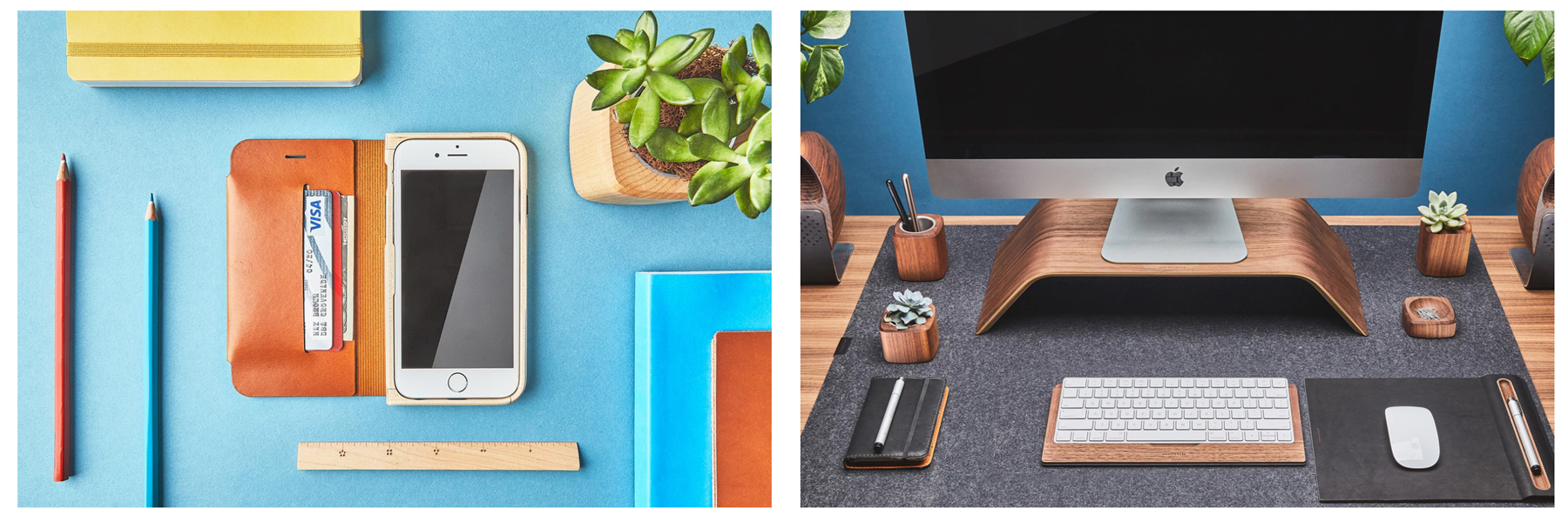
Now on to talk about the photography — this was one thing that originally caught my eye on the homepage and around the site. The photos are beautifully high-res and the product textures in them are totally awesome. I also love the pop of color behind the photo layouts, whether it be paper or a colored wall. If I had one wish about the design, it would be to incorporate some other title in the homepage banner other than just a product name. As I have learned looking throughout their site, their team and the environment is super unique. So, it would be cool if they came up with something as unique in their banner either about the product or even the company itself, but that’s just my opinion. Regardless, photography can make or break your site and Grovemade hits it out of the park.
It’s one thing to see that delightful serif font in the top banner, but to see it on white under that section is just stunning. Sorry, totally nerding out right now, but the type treatment on this website is so lovely.
As you scroll down the homepage, you see a video that shows the Grovemade process. It’s a great added piece to the homepage that gives some movement but also lets users see how their products are transformed. Below that section is the team zone. I spent much of my time when I first got to the site here because the hover effect of each person is fun! When you click onto someone you can read a small bio blurb about the person as well as some fun facts. You can also scroll through members without taking the user out of the experience of getting to know the team.
Nearing the bottom you have another product callout, which is a full-width photo that breaks the space up a little, and a ‘featured products’ section under that. You finally end with a blue-grey rectangle that tells you about what Grovemade believes. I think it’s interesting that they end on this note but I think that they have so many product callouts around that they just needed a break to tell customers a little more about them. I love how simple and beautiful their footer is with some of the pages broken out on the left side, a newsletter callout, and a ‘book consultation’ button. I must also point out that they have a nice ‘go up’ button that takes a user back up to the top of the page. This always stays in their footer for convenience. Overall, it’s an appealing, airy design.
Now that I’ve taken you through the homepage, let me quickly point out a few other things that I enjoy about the Grovemade site.
Product Pages
I appreciate that on the shop page they have their “Desk Shelf System” in a bigger callout to the side and outside of the grid. They do this a few times down the page thus making the layout more interesting and less predictable. I love the product photo hovers! It allows users to see more of the product without clicking into the product page. You’ll notice that not all of them have it, which can be a little strange, but in general, I think it’s great.
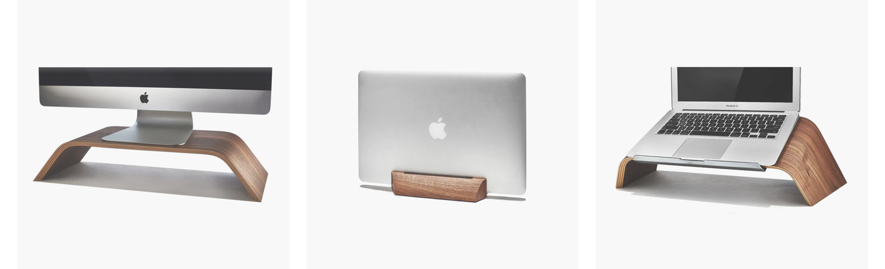
I also really enjoy the product detail page layout. Again, unexpected and unique so it keeps the user interested. When you get to any product page you can immediately add the product to your cart, or if you need more information on it you can scroll down and get the specs. On most, if not all, you can find other images of the product sitting on a desk and more up-close images, which is nice to see. I also noticed that on some of the product pages there is a video of how that product is made — totally awesome (for someone who loves seeing how things are made).
Illustrations & Animations
As you peruse around the site, you’ll notice on some pages that there are custom illustrations and animations of Grovemade products. I thought it was a fun touch while at the same time thought it was more of a random item. It would have been cool to see something like these on the homepage so they didn’t feel so odd sprinkled throughout interior pages. Nevertheless, I think these are neat and would have liked to see more of them around.
Journal (blog) Layout
The way this is designed is so smooth and easy-going. The newest post is featured up at the top with a bigger image and content splitting 50/50. Again, the photography lends a big hand in this design, making it feel personal to the company. Even the illustrations as images for some fit in here nicely. Everything is clean and just works. Plain and simple.
The interior post makes you feel like you’re reading a page in a magazine. The layout keeps the reader intrigued with different pull quotes, images and just the way the content continuously breaks the grid.
Site Atmosphere / Brand
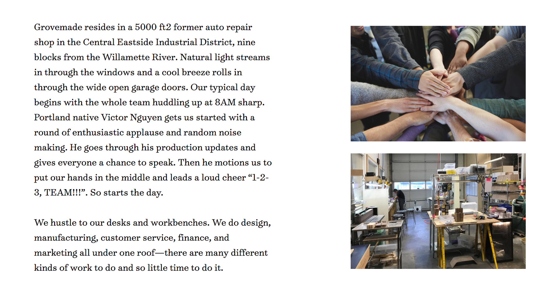
Lastly, I genuinely enjoy the atmosphere of the site. It brings you into the Grovemade world and makes you feel comfortable an invited. I think it’s important for a user to see how a company runs not only on the outside but on the inside as well. The website gives us many opportunities to see how the products are made and how the team operates, as well as just the general feeling of the company. This, to me, is necessary when you are building out your brand into a website. Your buyers may not be able to interact with you face-to-face, but a good brand will make you feel like you are.
Overall, I give this site an “A+” for a wonderfully done design. It has been enjoyable to immerse myself into Grovemade’s brand and get to know who they are and what they do. Like the website says “Design Inspires What You Do” — so let’s continue to get inspired with wonderful design!